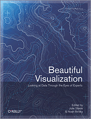
Sebastopol, CA—Visualization is the graphic presentation of data—portrayals meant to reveal complex information at a glance. Think of the familiar map of the New York City subway system, or a diagram of the human brain. Indeed, the most successful visualizations are beautiful not only for their aesthetic design, but also for elegant layers of detail that efficiently generate insight and new understanding.
In Beautiful Visualization (O'Reilly Media, $59.99 USD), two dozen experts—including Nick Bilton, lead technology writer for the New York Times Bits Blog, and Jessica Hagy, writer, speaker, and consultant—demonstrate how they apprach projects from a variety of disciplines. Together, these artists, designers, commentators, scientists, analysts, statisicians, and more show you what's possible with this medium, and how you can use it to make sense of the world.
"These are not your parents' bar graphs and pie charts," declares co-editor Julie Steele. "The contributors to Beautiful Visualization take you behind the scenes of their recent projects to share tips, techniques, and cautionary tales for turning data into design. You'll never look at infographics the same way again."
With Beautiful Visualization: Looking at Data through the Eyes of Experts, you will:
- Explore the importance of storytelling with a simple visualization exercise
- Learn how color conveys information that our brains recognize before we're fully aware of it
- Discover how the books we buy and the people we associate with reveal clues to our deeper selves
- Recognize a method to the madness of air travel with a visualization of civilian air traffic
- Find out how researchers investigate unknown phenomena, from initial sketches to published papers
For a review copy or more information please email peyton@oreilly.com. Please include your delivery address and contact information.
About the Editors
Julie Steele is an editor at O'Reilly currently working on titles related to Python, SQL, PHP, web frameworks and CMS, databases (relational and non-relational), big data and cloud computing, and data visualization. She's also interested in data transparency and open government, and recently completed a master's degree in political science at Rutgers University.
Noah Iliinsky has spent the last several years thinking about effective approaches to creating diagrams and other types of information visualization. He also works in interface and interaction design, all from a functional and user-centered perspective. Before becoming a designer he was a programmer for several years. He has a master's in Technical Communication from the University of Washington, and a bachelor's in Physics from Reed College.
For information on all the contributors, see:
http://oreilly.com/store/visual-contributors.csp.
Additional Resources:
For more information about the book, including sample content, full table of contents, author bio, and cover graphic, see:
http://www.oreilly.com/catalog/0636920000617.
For background on the article by Andrew Odewahn, "Visualizing the Senate social graph," see his blogpost on radar.oreilly.com.
Beautiful Visualization
Edited by Julie Steele & Noah Iliinsky
ISBN: 978-1-4493-7986-5, 416 pages,
Book Price: $59.99 USD, Ebook Price: $39.99 USD
order@oreilly.com
1-800-998-9938
1-707-827-7000
About O’Reilly
O’Reilly Media spreads the knowledge of innovators through its books, online services, magazines, and conferences. Since 1978, O’Reilly Media has been a chronicler and catalyst of cutting-edge development, homing in on the technology trends that really matter and spurring their adoption by amplifying “faint signals” from the alpha geeks who are creating the future. An active participant in the technology community, the company has a long history of advocacy, meme-making, and evangelism.
